SafeArea()
이 위젯은 운영 체제의 침입을 피하기 위해 충분한 패딩을 사용하여 하위 항목을 삽입하며, 1개의 하위 요소를 가질 수 있다.
앱을 만들다가 이렇게 글씨를 쓰면 핸드폰의 기본 설정 때문에 원치 않는 곳에 글씨가 쓰이는 경우가 있을 것이다. 이런 경우에는 SafeArea 라는 위젯을 쓰면 핸드폰의 기본 설정에 의해 글씨가 가려지거나 짤리지 않는 안전한 곳에 글씨가 쓸 수 있다. 아래의 왼쪽 사진이 SafeArea 위젯을 적용하기 전이고 오른쪽이 위젯을 적용한 후이다.
 |
|
void main() {
  runApp(MyApp());
}

class MyApp extends StatelessWidget {
  @override
  Widget build(BuildContext context) {
    return MaterialApp(
      home: Scaffold(
        backgroundColor: Colors.teal,
        body: SafeArea(
          child: Column(
            children: [
              Container(
                color: Colors.red,
                width: 100.0,
                height: 100.0,
              ),
            ],
          ),
        ),
      ),
    );
  }
}
Column() / Row()
Column 은 하위 항목을 수직 배열로 표시하는 위젯이고, Row 는 하위 항목을 수평 배열로 표시하는 위젯이다.
위에서 SafeArea 가 1개의 하위 요소를 가질 수 있다고 했는데, 만약 SafeArea 안에 여러 개의 요소를 넣고 싶을 때는 어떻게 해야할까? 그때는 Column 과 Row 를 쓰면 된다. Column 과 Row 는 여러 개의 하위 자식 요소들을 가질 수 있기 때문이다.
|
|
void main() {
  runApp(MyApp());
}

class MyApp extends StatelessWidget {
  @override
  Widget build(BuildContext context) {
    return MaterialApp(
      home: Scaffold(
        backgroundColor: Colors.teal,
        body: SafeArea(
          child: Column(
            children: [
              Container(
                color: Colors.red,
                width: 100.0,
                height: 100.0,
              ),
              Container(
                color: Colors.blue,
                width: 100.0,
                height: 100.0,
              ),
              Container(
                color: Colors.yellow,
                width: 100.0,
                height: 100.0,
              ),
            ],
          ),
        ),
      ),
    );
  }
}
CircleAvatar()
사용자를 나타내는 원으로, foregroundImage가 실패 하면 backgroundImage 가 사용되고 backgroundImage 도 실패 하면 backgroundColor 가 사용되며 radius 속성을 이용해 원의 크기를 설정할 수 있다.
아래의 사진은 각각 backgroundImage 만 적용한 경우/ backgroundColor + Text 를 적용한 경우이다. 이런 식으로 사용할 수 있다.
|
|
void main() {
  runApp(MyApp());
}

class MyApp extends StatelessWidget {
  @override
  Widget build(BuildContext context) {
    return MaterialApp(
      home: Scaffold(
        backgroundColor: Colors.teal,
        body: SafeArea(
          child: Center(
            child: Column(
              mainAxisAlignment: MainAxisAlignment.center,
              children: [
                CircleAvatar(
                  radius: 50.0,
                  // backgroudImage 만을 이용한 코드는 child 를 모두 지우고
                  // backgroundImage 주석을 해제하면 된다
                  // backgroundImage: NetworkImage('https://i.guim.co.uk/img/media/26392d05302e02f7bf4eb143bb84c8097d09144b/446_167_3683_2210/master/3683.jpg?width=620&dpr=2&s=none'),
                  backgroundColor: Colors.yellow,
                  child: Text(
                    'BM',
                    style: TextStyle(
                      fontSize: 40.0,
                      fontWeight: FontWeight.bold,
                    ),
                  ),
                ),
              ],
            ),
          ),
        ),
      ),
    );
  }
}
ListTile() / Card()
ListTile 은 일반적으로 일부 텍스트와 선행 또는 후행 아이콘을 포함하는 행이다. 주요 속성으로는 leading, title, subtitle 등이 있고, contentPadding 속성의 기본 값이 EdgeInsets.symmetric(horizontal: 16.0) 으로 설정되어 있기 때문에 padding 을 없애려면 따로 값을 설정해주어야 한다.
- leading 에는 일반적으로 Icon 위젯이나 CircleAvatar 위젯을 사용
- title 에는 일반적으로Text 위젯을 사용
- subtitle 은 title 아래 추가적인 콘텐츠를 표시하는 곳으로 일반적으로 Text 위젯을 사용
Card 는 약간 둥근 모서리와 입면 그림자가 있는 카드 형태를 제공한다. 기본적인 사이즈는 0 이고 하위 요소의 크기에 따라 크기가 결정된다.
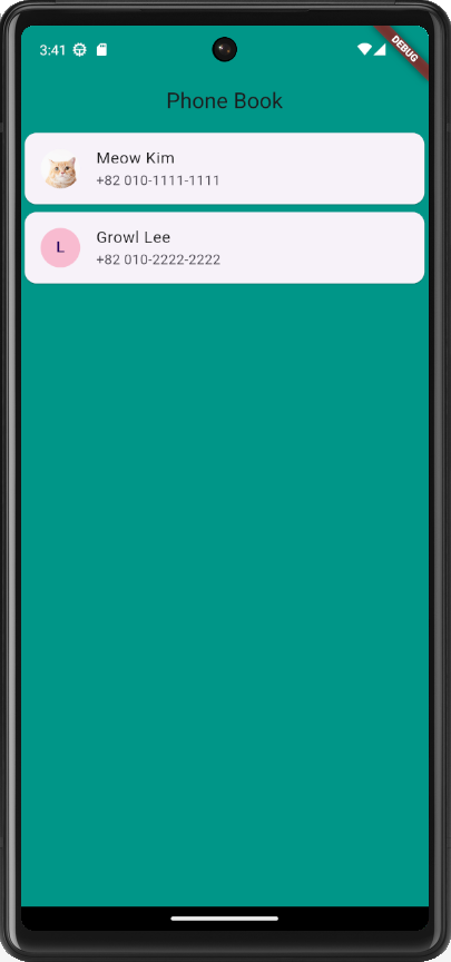
ListTile 과 Card 그리고 CircleAvatar 위젯을 사용하면 아래와 같이 전화번호부를 만들 수 있다.
void main() {
  runApp(MyApp());
}

class MyApp extends StatelessWidget {
  @override
  Widget build(BuildContext context) {
    return MaterialApp(
      home: Scaffold(
        appBar: AppBar(
          backgroundColor: Colors.teal,
          title: Center(
            child: Text('Phone Book'),
          ),
        ),
        backgroundColor: Colors.teal,
        body: SafeArea(
          child: Column(
            children: [
              Card(
                child: ListTile(
                  leading: CircleAvatar(
                    backgroundImage: NetworkImage(
                        'https://health.chosun.com/site/data/img_dir/2023/07/17/2023071701753_0.jpg'),
                  ),
                  title: Text('Meow Kim'),
                  subtitle: Text('+82 010-1111-1111'),
                ),
              ),
              Card(
                child: ListTile(
                  leading: CircleAvatar(
                    backgroundColor: Colors.pink.shade100,
                    child: Text('L'),
                  ),
                  title: Text('Growl Lee'),
                  subtitle: Text('+82 010-2222-2222'),
                ),
              ),
            ],
          ),
        ),
      ),
    );
  }
}
📖 References 📖
https://api.flutter.dev/index.html
Flutter - Dart API docs
Welcome to the Flutter API reference documentation! Flutter is Google's SDK for crafting beautiful, fast user experiences for mobile, web, and desktop from a single codebase. Flutter works with existing code, is used by developers and organizations around
api.flutter.dev
'Flutter' 카테고리의 다른 글
| [Flutter/플러터] 버전 에러 고치기 2 (1) | 2024.01.24 |
|---|---|
| [Flutter/플러터] BUG! exception in phase 'semantic analysis' in source unit '_BuildScript_' Unsupported class file major version 61 (0) | 2024.01.23 |
| [Flutter/플러터] Flutter Outline 작동 안될 때 (0) | 2024.01.21 |
| [Flutter/플러터] 버전 에러 고치기1 (2) | 2024.01.21 |
| [Flutter/플러터] 안드로이드 스튜디오에 깃 레포지토리 클론해오기 (0) | 2024.01.21 |


